
DULUX PAINT COLOUR
Dulux Pressed Petal
Pressed Petal is a light-to-mid muted red, with an undertone that is warm, with a pink or red cast. See it at room scale before you buy a tester: try Pressed Petal on the walls of your own room in the free 3D planner.
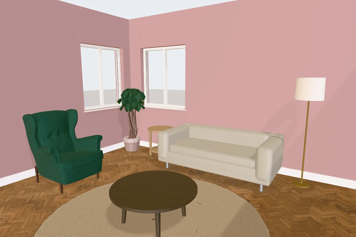
Pressed Petal at a glance
| Brand | Dulux |
| Colour name | Pressed Petal |
| Hex (on screen) | #BC9795 |
| RGB | 188, 151, 149 |
| Light reflectance (est.) | About 35 |
| Looks like | Light-to-mid muted red |
| Undertone | Warm, with a pink or red cast |
| Popularity | The 18th most searched Dulux colour in the planner’s library: about 4,800 searches a month in the UK |
The hex value is the planner’s on-screen approximation, not a paint formula, and the light reflectance is estimated from it. Screens, daylight, bulbs and sheen all change how a paint looks, so check a physical sample or tester pot on your wall before you order. The official Dulux colour page has the manufacturer’s own details.
How Pressed Petal behaves in a room
With an estimated light reflectance of about 35, it absorbs a fair amount of light. Expect it to look noticeably deeper on a wall that faces away from the window than on the swatch.
Its undertone is warm. Warm colours hold up well in north-facing rooms, where daylight is cooler, and can look richer or more yellow in strong south-facing light.
Where it tends to be used
Mid-depth colours like this tend to go on a single feature wall, in bedrooms and snugs, on kitchen units and islands, or across a whole room with plenty of daylight.
Try Pressed Petal in your room. Draw your room to size or open a furnished bedroom, then paint the walls in 3D. Free, with no sign-up.
Open the planner →Colours that pair with Pressed Petal
Suggestions from the same Dulux range in the planner, chosen for contrast or a tonal match. Try them side by side on different walls before deciding.
Closest matches from other brands
The colours from other brands in the planner that look nearest to Pressed Petal on screen, measured by colour difference (ΔE: under 2.5 is hard to tell apart on screen, over 9 is clearly different). Useful if you like the look but want a different brand or price.
Try Pressed Petal on your own walls in 3D
- Open the planner and draw your room to its real size, or start from a furnished layout such as the living room or bedroom examples.
- Switch to 3D and open the Design panel, then choose Walls.
- Search for “Pressed Petal”, or filter by brand. Paint the whole room or select a single wall for a feature wall.
The planner is free with no sign-up. Brand paint colours are premium finishes: you can preview Pressed Petal in your room for free, and Plus keeps brand colours in your saved plan.
More Dulux colours
Questions
Is Dulux Pressed Petal warm or cool?
On screen it reads as warm: its undertone is warm, with a pink or red cast. Check a sample in your own light, as the direction a room faces changes how warm or cool a colour looks.
What is the LRV of Pressed Petal?
Estimated from the on-screen colour, its light reflectance value is about 35 on a scale where 0 is black and 100 is pure white. The manufacturer’s published LRV is measured from real paint and may differ slightly.
What is the closest match to Pressed Petal from another brand?
In the planner’s library, the nearest on screen is Little Greene Hellebore (No. 275). On-screen matches are a starting point only: compare real samples side by side before switching.